urban designer & researcher
Utrecht, a city of contradictions.
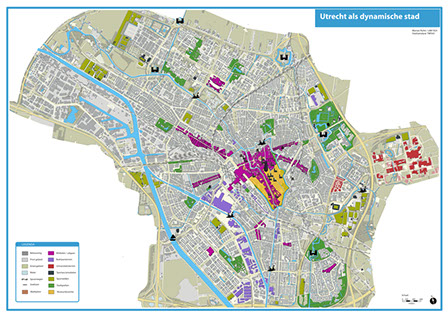
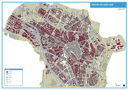
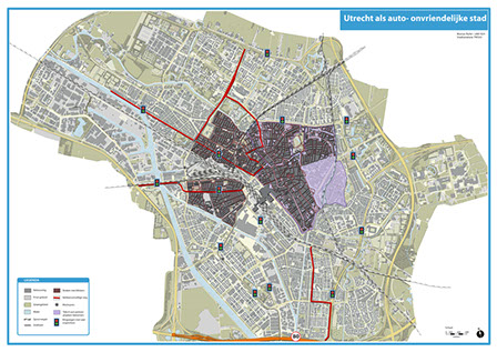
Urban analysis is a cartographic exercise. The idea is to express several characteristics of a city by the use of different colors, structures, thickness, symbols, transparencies etc. By the use of graphic elements you are able to "lie" in your map to express different characteristics. The use of these graphical elements are supported by the theory of M. Monmonier (1991), How to lie with Maps and A.M. MacEacheren (1995), How maps work: Representation, Visualisation and Design. I analysed the Dutch city Utrecht, because I have been living there and I know the city very well. In a sequence of 8 maps with 4 themes, the maps expresses the city in a negative and a positive way.
Most of the time I used a combination of graphical tools. For the car friendly map for example, I used thicker lines for the highways in a friendly soft color and I used symbols to show where there are car parks. And on the other side, for the car unfriendly map, used darker colors in the center of Utrecht, to make it unattractive. By using shadows around the buildings, streets becomes even more narrow. Finally I also used a texture in the center, which stands for uncomfortable pavement. Besides of that you have to think about the function and reader of the map as well. For example in the map of the dynamic city. Most of the time tourists will use these kind of maps, therefore the use of symbols are the most suitable, because that want to see in a glance where the attractions are.
original format: A0


Utrecht as a green city versus a non-green city: green
Utrecht as a green city versus a non-green city: polluted
Utrecht as a dynamic versus non-dynamic city: dynamic
Utrecht as a dynamic versus non-dynamic city: boring
Utrecht as a city of good public transport versus bad public transport: good
Utrecht as a city of good public transport versus bad public transport: bad
Utrecht as a good city to use the car versus a bad city to use the car: good
Utrecht as a good city to use the car versus a bad city to use the car: bad
<
>
next >
Copyright 2011 Manoe Ruhe. All rights reserved. Last updated December 2014
